Oxyvit is a flagship multivitamin brand by Dexa Group, formulated to provide superior antioxidant protection through Vitamin C, E, and A. In a crowded market of generic supplements, Oxyvit stands out for its clinical efficacy and high-quality standards. The goal of this project was to transform Oxyvit’s digital presence from a standard "pharmacy product" page into a high-end wellness brand that resonates with today’s health-conscious, active generation.

Vitamin brands often fall into one of two traps: they are either too "clinical and cold" (boring) or too "loud and cluttered" (looking like cheap retail).
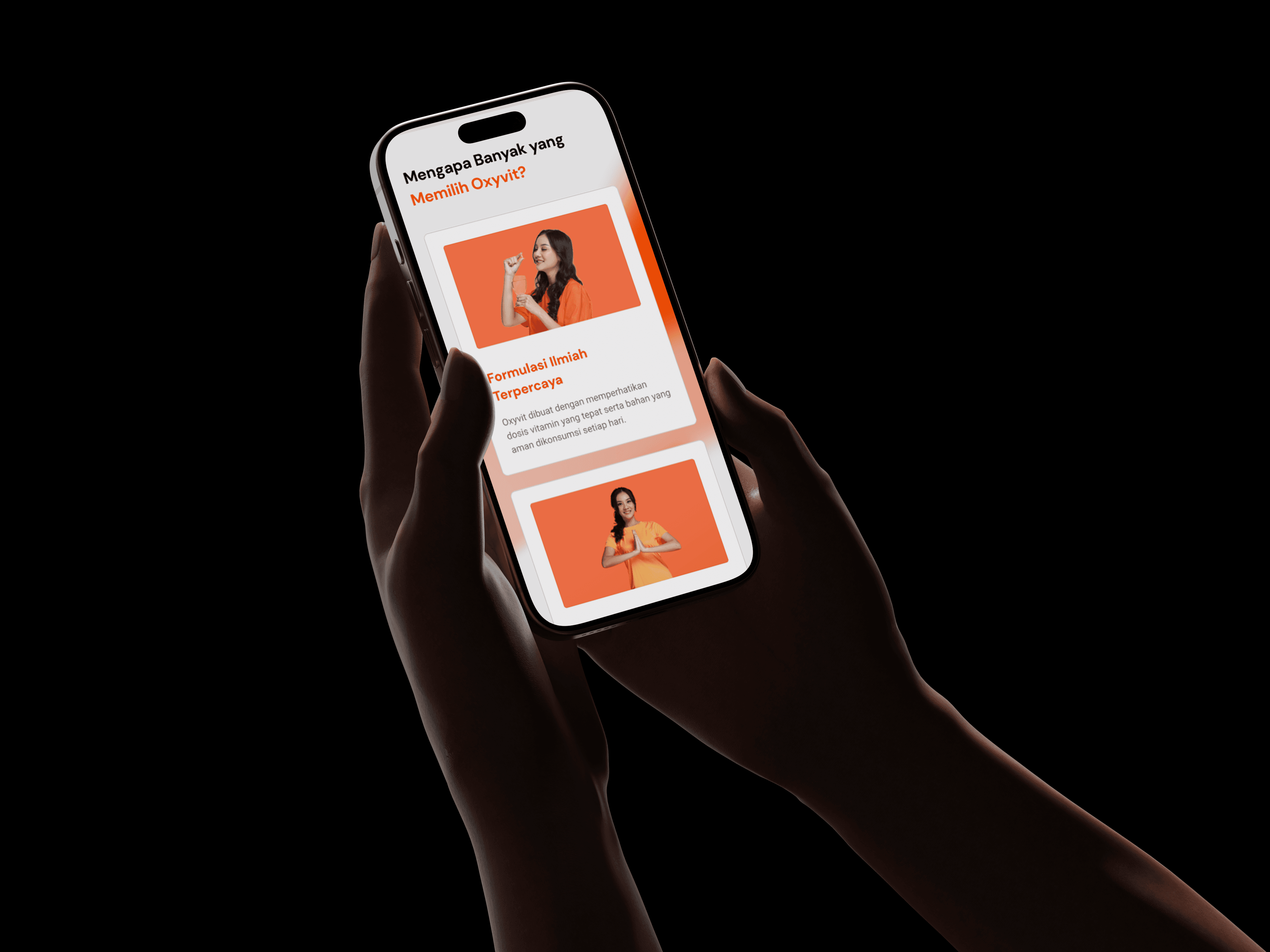
The Problem: The original Oxyvit site felt dated and lacked a clear brand story. It didn’t communicate the feeling of being healthy; it only listed ingredients.
UX Friction: The product benefits were buried in technical text, making it difficult for consumers to quickly understand which variant (Oxyvit, Oxyvit D3, etc.) was right for them.
Mobile Engagement: The layout wasn't optimized for "on-the-go" shopping or quick education, which is how most consumers research supplements today.


UX Strategy
We moved away from a technical manual approach to a "Benefit-First" user journey.
Personality-Based Navigation: We restructured the UX to guide users based on their needs—whether it’s "Immune Support," "Skin Health," or "Daily Energy."
Comparison Engine: Developed a minimalist product comparison tool that simplifies the science, allowing users to differentiate between product lines with a single glance.
Educational Flow: We integrated a "Science of Antioxidants" section that breaks down complex biomolecular benefits into digestible, interactive "scroll-telling" segments.
UI Strategy
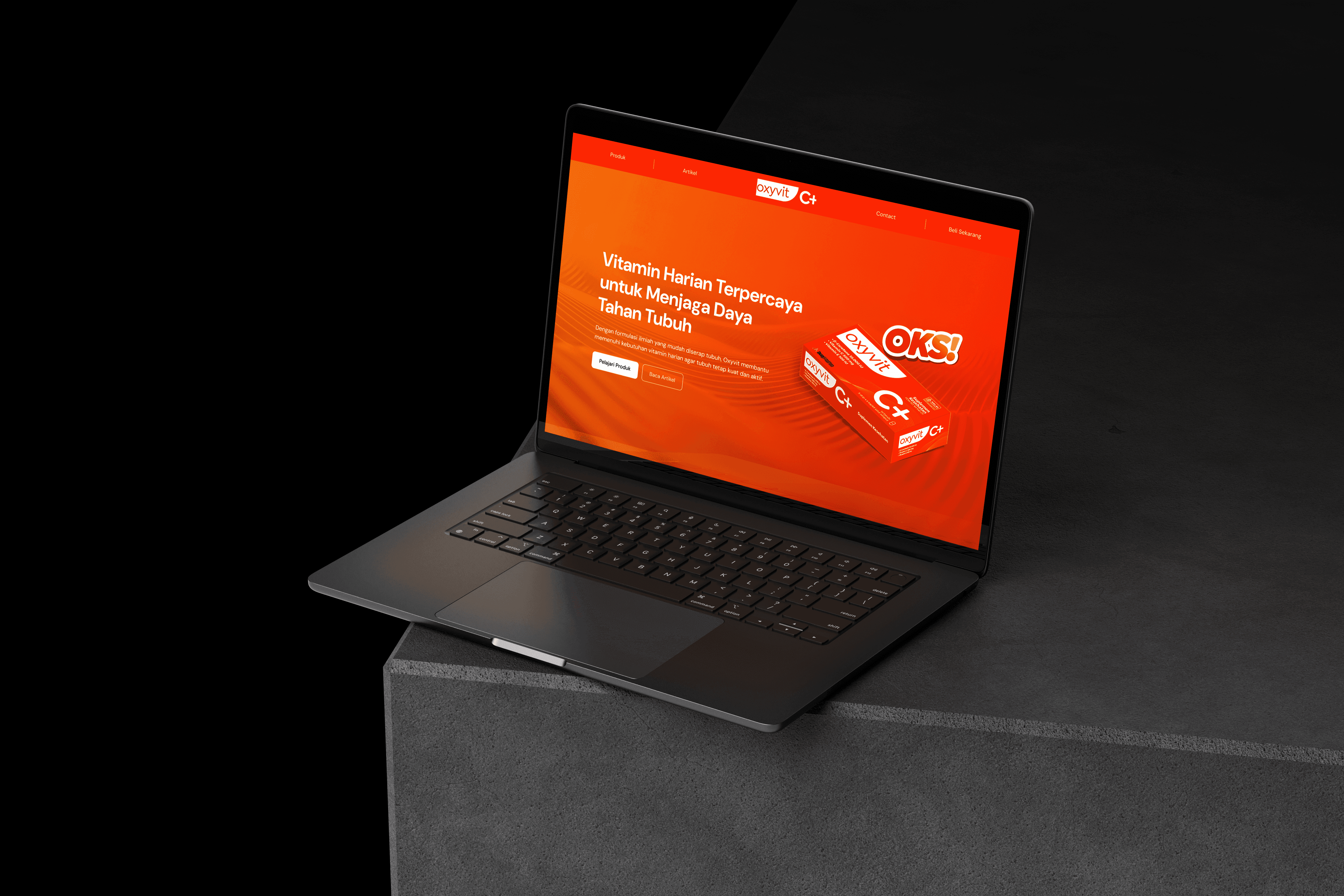
The aesthetic direction was "Vibrant Minimalism"—clean, white-space-driven design accented by high-energy colors.
The Palette: We retained the iconic "Oxyvit Orange" but refined it into a more sophisticated, premium gradient. This was paired with a crisp "Laboratory White" and "Deep Navy" to maintain medical credibility.
Lifestyle Imagery: We replaced generic stock photos with high-end, editorial-style imagery that focuses on "The Glow of Health"—emphasizing skin texture, natural light, and active movement.
Typography: We chose a modern, geometric Sans-Serif (Manrope) to give the brand a friendly yet authoritative voice. Large headlines and generous leading make the technical info feel light and easy to read.
Glassmorphism & Depth: Used subtle glass-morphism effects on product cards to evoke a sense of "transparency and purity," reflecting the high quality of the ingredients.