Dexa Group is a leading research-based pharmaceutical company with a massive global footprint. However, their digital presence lagged behind their scientific innovation. The goal was to redesign the DexaGroup.com ecosystem to reflect their "Expertise for the Promotion of Health" through a high-end, professional, and accessible web experience that serves stakeholders, healthcare professionals (HCPs), and consumers alike.

The legacy Dexa Group website suffered from "Information Overload." As a conglomerate with multiple subsidiaries (DLBS, Ferron, Dexa Medica), the UX was fragmented.
Navigation Friction: Users struggled to find specific clinical data or corporate reports due to a bloated menu structure.
Visual Inconsistency: The UI felt dated and "heavy," lacking the clean, innovative feel of a modern biotech company.
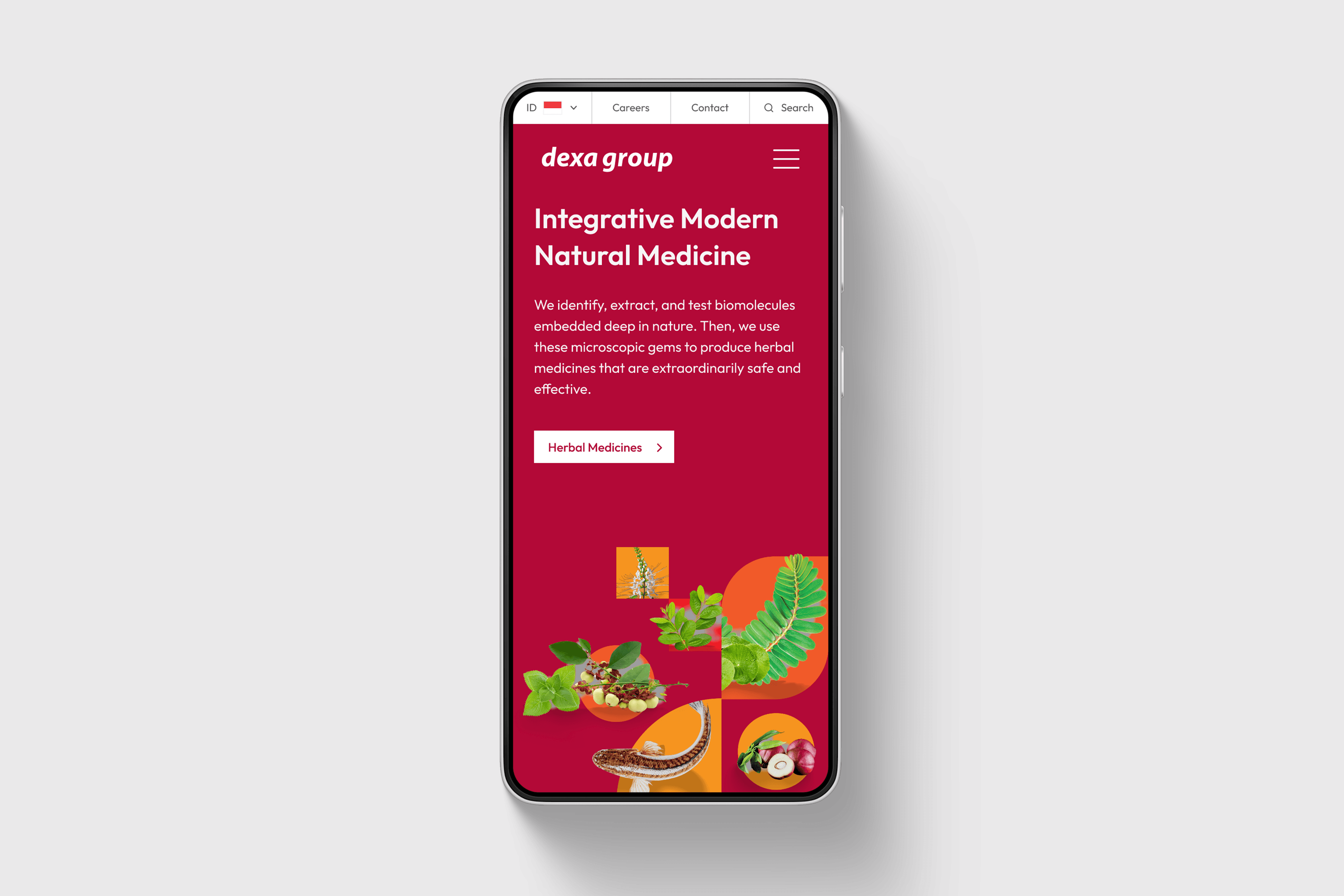
Mobile Fragmentation: The complex data tables and scientific charts were not optimized for mobile devices, alienating users on the go.

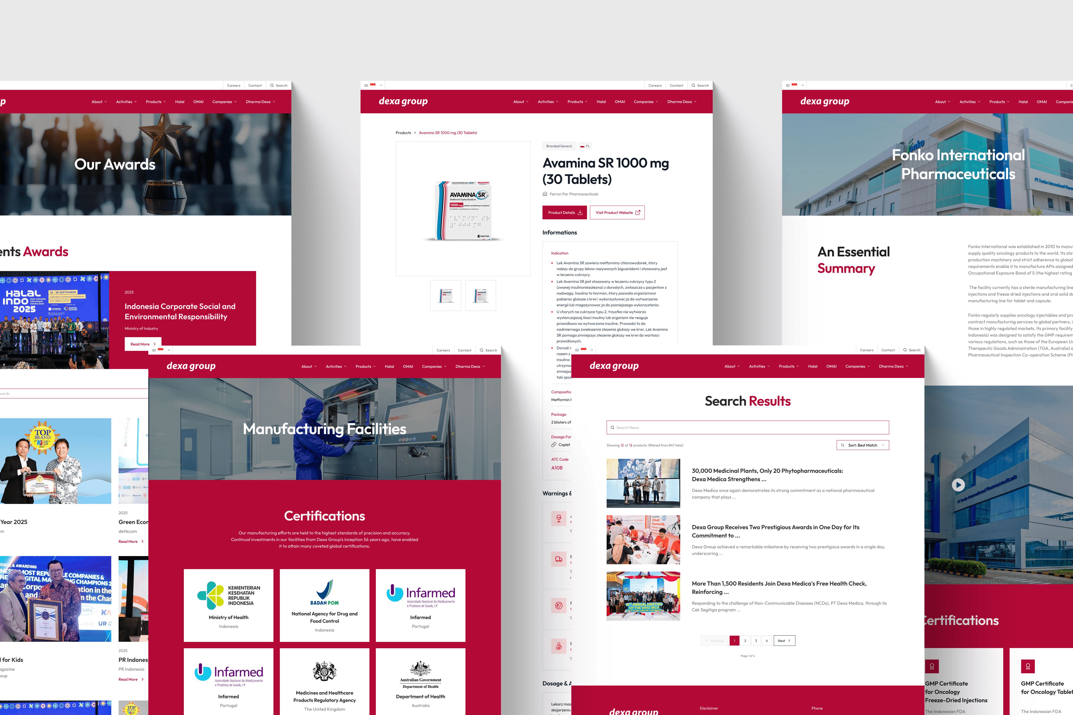
UI Execution
The aesthetic direction was "Clinical Minimalism"—where scientific precision meets high-end digital design.
The "Clean Science" Aesthetic: We moved away from cluttered layouts to a grid-based system with generous white space. This mirrors the "sterile and precise" environment of a laboratory.
Typography & Hierarchy: We utilized a sophisticated Sans-Serif typeface (Inter) for its high legibility in technical reading, paired with a bold, authoritative weight for headlines to establish trust.
Color Theory: We refined the signature Dexa Blue, pairing it with a "Med-White" and soft slate grays to create a palette that feels professional, trustworthy, and calming.
Micro-interactions: Subtle hover states and smooth scroll animations were implemented to give the site a "premium" feel, making the discovery of their research feel like a modern, high-tech experience.
UX Strategy
We prioritized clarity and flow, ensuring that every user type—from an investor to a pharmacist—could find their destination in three clicks or less.
Information Architecture (IA) Overhaul: We mapped out a new sitemap that categorized the vast content into three core pillars: Innovation (R&D), Business Segments, and Social Impact.
Stakeholder-Centric Journeys: Created dedicated pathways for HCPs to access product catalogs and for investors to find financial disclosures without friction.
Responsive Data Visualization: We redesigned complex biomolecular charts and corporate growth graphs to be interactive and fully responsive, ensuring "Science on the move" was a reality.